According to Kotaku, the release of Metroid Prime 4: Beyond has sparked a fierce online debate about its graphics, with many criticizing its open-world desert sections as bland and dated, comparing them to games from 20 years ago. The game currently holds an 81 on Metacritic, a notable drop from the 90+ scores of the original trilogy, fueling some of the negative reaction. However, players and reviewers like NPR’s Vincent Acovino are praising it as a “technical marvel,” especially in its detailed, dungeon-like areas. The visual disparity is so pronounced that shots from the same trailer swing from “pretty alright” to the ugly screenshots causing outrage. Retro Studios, the developer, includes staff who previously worked on Halo at 343 Industries, which some say influences the game’s stronger visual identity.


Ugly Screenshots vs. Actual Gameplay
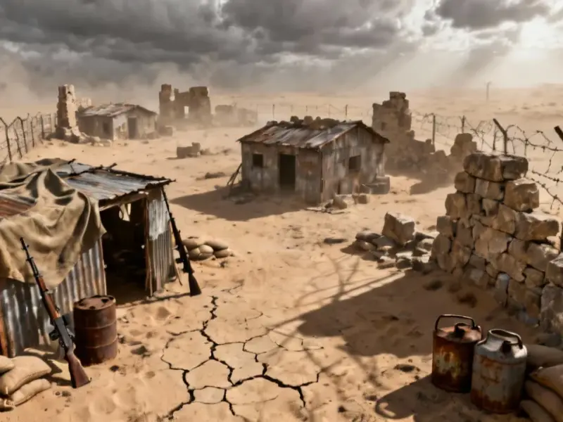
Here’s the thing about judging a game by its screenshots: it’s a terrible idea, but we all do it. The desert shots from Metroid Prime 4 are, frankly, not great. They look sparse and weirdly flat. But this is a classic case of a bad still frame telling a completely different story from the actual experience of playing. It’s like judging a movie by a single, blurry frame. Games are about motion, atmosphere, and lighting—things a JPEG can’t capture. People playing on high-end OLED TVs with HDR are raving about how it looks. So which is it? Probably both. The game seems to have some real low points visually, but its high points are apparently stunning.
The Open-World Trap
And this gets to a bigger issue with Nintendo and open-world design. The article’s author makes a sharp comparison to Pokémon Scarlet and Violet, which look objectively unfinished. When you try to make a huge, seamless world on aging or limited hardware, something’s gotta give. Usually, it’s environmental detail and texture quality. Metroid Prime 4 seems to have put its visual budget into the bespoke, interior “dungeon” areas—the parts that feel most like the original, beloved Prime games. The open zones? They might just be functional corridors connecting the good stuff. Is that a worthy trade-off? For some players, absolutely not. For others, the atmosphere and gameplay in those detailed areas will make them forget the bland deserts entirely.
Review Score Panic
Let’s be real: a lot of this “ugly” discourse is just a proxy for anxiety about the 81 Metacritic score. For a series that used to be a critical darling, that feels like a drop. So you get people calling it a “fucking disaster” on forums. It’s a reaction to a number, not necessarily to the game itself. An 81 is still a good score! But in the hyper-competitive, hype-driven world of game releases, it gets framed as a failure. So the bland desert screenshots become ammunition for a narrative that the game has “fallen off.” It’s a knee-jerk cycle we see all the time now.
So What’s The Verdict?
Basically, Metroid Prime 4 sounds like a game of visual extremes. It’s not a consistent, graphical powerhouse across every square inch. It has barren, last-gen-looking areas and breathtaking, atmospheric sequences. The question is, which experience dominates your playtime? If you’re constantly traversing those open sections, you might be annoyed. If they’re just brief transitions between incredible set-pieces, you’ll probably forgive them. The internet, of course, will cling to the worst-looking screenshots forever. But the people actually playing it seem to be finding a lot to love where it counts. Isn’t that what usually matters?